Design Blocks
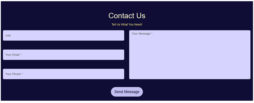
Design Blocks are used to add design elements to a page to make certain information stand out, such as Contact Us forms, etc.
Contents
Getting Started
Click here for information on Installing Add-Ons.
To use Design Blocks, login and click ADMIN, MANAGE ADD-ONS, DESIGN BLOCKS.
To set preferred theme and font, select DESIGN BLOCK SETTINGS.
In the first field choose a font, which is indicated by font- .....
In the second field choose a theme, which is indicated by theme-....
Click OK to save changes.
Terms
- Contact US
- Enables you to drop a Contact Us form on the page that collects data from a user and can redirect to a Thank You page after the user submits the form.
- Four Column
- This allows you to add 4 equal columns to a page, with the ability to add different types of add-ons in each column.
- Tile
- Provides a way to add text that you want to stand out, including a headline, a brief description, an image and a button with unique text and a link.
- Hero Image
- Provides a way to add a section title, a brief description, an image background and a button with unique text and a link.
- Three Column
- Adds three equal columns on a page with the ability to add different add-ons within each column.
- Sliders
- Enables users to add a slider with up to 10 slides to a page with an image, text and a link.
- Text and Image
- Enables you to drop a section on a page with a picture, title and descriptive text.
Roles
- Administrator
- The site user with administrator rights who configures and maintains the ecommerce system.
- User
- Anyone with a record in the People table.
- Customer
- The user who purchases online, creating an invoice, paying, etc.
How-To
Add a Design Block Section to a Web Page
When you are on the web page where you would like the banner to appear and are logged on as an Administrator, you will select the EDIT option from the menu. Next, click the paper/pencil icon. This will take you to the Edit record for your page.
On this screen put your cursor in the Copy box, click on the Add-on drop down menu and select LP-Name of specific item you want to drop on page. An image with the Contensive logo will appear in the Copy Box. Click OK at the top of the page to save the banner to your webpage.
After you click OK, you will go to ADMIN, MANAGE ADD-ONS, DESIGN BLOCKS, and then choose the table from the list below which matches the add-on you dropped on the page. Once you select that, you will click ADD to add a new record and follow the steps for each specific landing page section.
Contact US
Click on DB CONTACT US under Design Blocks.
Click ADD.
- In the DETAILS tab, add information for Form Title.
- In the CSS tab choose a font in the firstCustomCssClass field and choose your color theme in the secondCutomCSSClass field.
- In the FORM SETTINGS tab:
- Add a Title to display
- Add a Description with more details for the visitor
- Add Button Text to show up on the button
- Add a URL for the Action Page (such as /Thank You) that the user is redirected to after clicking the button
- Add the title for the Thank You page
- Add the text for the Thank You page
- Specify the number of seconds before you are directed to the page specified in Thank You Redirect Page field. If you set the Thank You Reload Seconds to 0, then the user will stay on the Thank You page until they choose to go to another page.
Click OK to save changes.
NOTE: Go to ADMIN>DESIGN BLOCKS>DB CONTACT US DATA to see information submitted through the Contact Us form.
Four Column
Click on DB FOUR COLUMN under Design Blocks.
Click ADD.
- In the DETAILS tab, select which Add-on you want for each of the four columns. You may choose the same one for all columns or a different one for each.
- Click OK to save changes.
Tile
Click on DB TILES under Design Blocks.
Click ADD.
- In the DETAILS tab:
- Select an image by clicking CHOOSE FILE.
- Add a headline for the new section.
- Enter descriptive text
- Add text for a button
- Provide the URL for the button to link to.
- In the Styles tab choose a font and theme. Also click on Top Padding, Right Padding, Bottom Padding or Left Padding if you want to leave space in any of those areas.
Click OK to save.
Hero Image
Click on DB HERO IMAGE under Design Blocks.
Click ADD.
- In the DETAILS tab:
- Add a Name for the new record, which shows as the title.
- Add a Sub Title for the new section.
- Upload an Image Background. Recommended minimum width is 1920 px; recommened maximum height is 1085 px.
- Select the Shade for the CSS Class.
- Enter text to display on the button.
- Enter the URL to link to when a user clicks on the button. Include http:// or https:// as part of the URL.
Click OK to save.
- In the STYLES tab select the Font and Theme. Also select Top Padding, Right Padding, Bottom Padding or Left Padding if you want to leave space in any of those areas.
Three Column
Click on DB Three COLUMN under Design Blocks.
Click ADD.
- In the DETAILS tab, select which Add-on you want for each of the four columns. You may choose the same one for all columns or a different one for each.
- Click OK to save changes.
Slider
Click on DB SLIDER under Design Blocks.
Click ADD.
- In the DETAILS tab add a Name for the new record.
- In the CSS tab choose a font in the firstCustomCssClass field and choose your color theme in the secondCutomCSSClass field.
- In the SLIDERS tab:
- Upload an image for the first slide.
- Add text for the first slide.
- Add the URL to forward to when a user clicks the image. Include http:// or https:// as part of the URL.
- Repeat for each slide that you want to display.
- Click OK to save slides.
Text and Image
Click on DB TEXT AND IMAGE under Design Blocks.
Click ADD.
- In the DETAILS tab:
- Add a Name for the new record, which appears as the title.
- Enter descriptive text.
- Upload the image.
- In the Styles tab choose a font and theme. You can also check the boxes next to Top Padding, Right Padding, Bottom Padding and Left Padding if you want to leave space in any of those areas.
Click OK to save.


